Design & Features
Typography
JSN YoYo 2 was developed with extreme focus on typography and we believe it provides the most comprehensive content presentation capability. Headings, text, links, tables, images, everything was designed with high level of refinement. Let's take a look.
Headings
This is an H1 Header
Lorem ipsum dolor sit amet consectetuer eleifend elit vel tellus laoreet. At ut pellentesque risus quis sem eros et consequat enim lorem. Aenean lorem consequat consequat eu.
This is an H3 Header
Lorem ipsum dolor sit amet consectetuer eleifend elit vel tellus laoreet. At ut pellentesque risus quis sem eros et consequat enim lorem. Aenean lorem consequat consequat eu.
This is an H5 Header
Lorem ipsum dolor sit amet consectetuer eleifend elit vel tellus laoreet. At ut pellentesque risus quis sem eros et consequat enim lorem. Aenean lorem consequat consequat eu.
This is an H2 Header
Lorem ipsum dolor sit amet consectetuer eleifend elit vel tellus laoreet. At ut pellentesque risus quis sem eros et consequat enim lorem. Aenean lorem consequat consequat eu.
This is an H4 Header
Lorem ipsum dolor sit amet consectetuer eleifend elit vel tellus laoreet. At ut pellentesque risus quis sem eros et consequat enim lorem. Aenean lorem consequat consequat eu.
This is an H6 Header
Lorem ipsum dolor sit amet consectetuer eleifend elit vel tellus laoreet. At ut pellentesque risus quis sem eros et consequat enim lorem. Aenean lorem consequat consequat eu.
h1. Bootstrap heading
h2. Bootstrap heading
h3. Bootstrap heading
h4. Bootstrap heading
h5. Bootstrap heading
h6. Bootstrap heading
Blockquotes
Default Blockquote
You can us this style to quote somebody's speech, idea or a fragment from some book, articles, etc. Lorem ipsum dolor sit amet consectetuer eleifend elit vel tellus laoreet. At ut pellentesque risus quis sem eros et consequat enim lorem. Aenean lorem consequat consequat eu.
Usage: <blockquote>This is your quote</blockquote>
Highlighted Text
You can use this style to highlight important words and / or keyword expression in search result page. Lorem ipsum dolor sit amet consectetuer eleifend elit vel tellus laoreet. At ut pellentesque risus quis sem eros et consequat enim lorem. Aenean lorem consequat consequat eu.
Usage: <span class="text-highlight">This is the text to be highlighted.</span>
Alerts
Bootstrap provides an easy way to create predefined alert messages:
Success! You should read this message.
Info! You should read this message.
Warning! You should read this message.
Danger! You should read this message.
Closing Alerts
To close the alert message, add a .alert-dismissable class to the alert container. Then add class="close" and data-dismiss="alert" to a link or a button element (when you click on this the alert box will disappear).
Animated Alerts
To close the alert message, add a .alert-dismissable class to the alert container. Then add class="close" and data-dismiss="alert" to a link or a button element (when you click on this the alert box will disappear).
Link Styles
Link Icon Styles
You can attach up to 28 predefined icons to the front of any link by adding simple class to it.
- Link with article icon
- Link with calendar icon
- Link with cart icon
- Link with comment icon
- Link with display icon
- Link with star icon
- Link with folder icon
- Link with home icon
- Link with image icon
- Link with info icon
- Link with mail icon
- Link with rss icon
- Link with search icon
- Link with selection icon
- Link with help icon
- Link with database icon
- Link with check icon
- Link with calculator icon
- Link with edit icon
- Link with arrows icon
- Link with download icon
- Link with flag icon
- Link with diamond icon
- Link with users icon
- Link with level-up icon
- Link with remove icon
- Link with reply icon
- Link with love icon
This is link to download something.
Usage: <a class="link-icon jsn-icon-xxx">This is link text.</a>, where xxx is the name of icon to be applied. Detailed information about all icon names can be found in template documentation.
Example: <a class="link-icon jsn-icon-download">This is link to download something.</a>
Link Button Styles
JSN Venture offers 12 button styles to decorate any call-to-action links you have in the content.
Usage: <a class="link-button button-xxx">This is link text.</a>, where xxx is the button color name selected from: light, dark, green, orange, blue and red.
Example: <a class="link-button button-orange">See plans & pricing.</a>
Table Styles
Plain Rows table style
| Table header | Column header 1 | Column header 2 | Column header 3 |
|---|---|---|---|
| Row header 1 | Lorem ipsum | Dolor sit amet | Lorem ipsum |
| Row header 1 | Lorem ipsum | Dolor sit amet | Lorem ipsum |
| Row header 1 | Lorem ipsum | Dolor sit amet | Lorem ipsum |
| Row header 1 | Lorem ipsum | Dolor sit amet | Lorem ipsum |
| Row header 1 | Lorem ipsum | Dolor sit amet | Lorem ipsum |
| Table footer | Footer data | ||
Color Stripes table style
| Table header | Column header 1 | Column header 2 | Column header 3 |
|---|---|---|---|
| Row header 1 | Lorem ipsum | Dolor sit amet | Lorem ipsum |
| Row header 1 | Lorem ipsum | Dolor sit amet | Lorem ipsum |
| Row header 1 | Lorem ipsum | Dolor sit amet | Lorem ipsum |
| Row header 1 | Lorem ipsum | Dolor sit amet | Lorem ipsum |
| Row header 1 | Lorem ipsum | Dolor sit amet | Lorem ipsum |
| Table footer | Footer data | ||
List styles
Standard list styles
Unordered list
- Lorem ipsum dolor sit amet
- Consetetur sadipscing elitr
- Sed diam voluptua
Ordered list
- Lorem ipsum dolor sit amet
- Consetetur sadipscing elitr
- Sed diam voluptua
Arrow list styles
Red arrow
- Lorem ipsum dolor sit amet
- Consetetur sadipscing elitr
- Sed diam voluptua
Blue arrow
- Lorem ipsum dolor sit amet
- Consetetur sadipscing elitr
- Sed diam voluptua
Green arrow
- Lorem ipsum dolor sit amet
- Consetetur sadipscing elitr
- Sed diam voluptua
Icon list styles
Article icon list
- Lorem ipsum dolor sit amet
- Consetetur sadipscing elitr
- Sed diam voluptua
Folder icon list
- Lorem ipsum dolor sit amet
- Consetetur sadipscing elitr
- Sed diam voluptua
Image icon list
- Lorem ipsum dolor sit amet
- Consetetur sadipscing elitr
- Sed diam voluptua
Online icon list
- Lorem ipsum dolor sit amet
- Consetetur sadipscing elitr
- Sed diam voluptua
Star icon list
- Lorem ipsum dolor sit amet
- Consetetur sadipscing elitr
- Sed diam voluptua
User icon list
- Lorem ipsum dolor sit amet
- Consetetur sadipscing elitr
- Sed diam voluptua
You can assign any of predefined 20 icons to list items. 6 icons shown above are just samples.
Number list styles
Blue Bullet number list
- 1Lorem ipsum dolor sit amet
- 2Consetetur sadipscing elitr
- 3Sed diam voluptua
Green Bullet number list
- 1Lorem ipsum dolor sit amet
- 2Consetetur sadipscing elitr
- 3Sed diam voluptua
Red Bullet number list
- 1Lorem ipsum dolor sit amet
- 2Consetetur sadipscing elitr
- 3Sed diam voluptua
Blue Digit number list
- 1Lorem ipsum dolor sit amet
- 2Consetetur sadipscing elitr
- 3Sed diam voluptua
Green Digit number list
- 1Lorem ipsum dolor sit amet
- 2Consetetur sadipscing elitr
- 3Sed diam voluptua
Red Digit number list
- 1Lorem ipsum dolor sit amet
- 2Consetetur sadipscing elitr
- 3Sed diam voluptua
Module Styles
JSN Templates provides 4 box designs for module background styling, which can be combined with 20 predefined icons for module title styling. Take a look around to see how module styles are applied.
Layout
New Drag-n-Drop Layout Builder
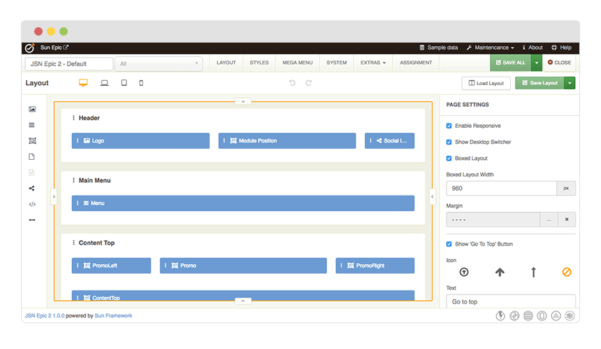
The good new is, with the new Sun Framework, you can freely modify any layout element in JSN Templates to any degree with complete design control. This framework helps you go beyond any limit that you might experience with the first JSN Templates or any other Joomla templates in the market.
Unlimited Module Positions
Just with drag-n-drop in the Layout Builder, you can create Joomla module position on the fly without having to write a single line of code. Thanks to the power of Sun Framework, JSN Templates provides UNLIMITED module positions in addition to the pre-built ones.
See full features of Sun Framework here
Layout Variations
JSN Templates layout system is flexible and capable than ever before. The built-in module positions are designed in smart way to cover all possible spot where you might want to put content. However, please do not be confused by them or think that they are all the variations that you can have. They are are just some examples that we create to help you speed up your site development process. You can create your own layout variation in any style you want. Bellow is live presentation of some most popular layout variations:
Menu Styles
JSN Sky provides 4 menu styles to present your website navigation. The default Joomla! built-in menu module (mod_mainmenu) is utilized, so you don't need to install any external menu modules.
Main Menu

Main Menu is very powerful menu built with clean accessible XHTML code structure and effective drop-down submenu panels.
Main Menu with icons and rich text

You can add icon and descriptive text to each menu item to make them much clearer and more appealing. Both descriptive text and icons are configured directly in menu item settings page, which is very convenient.
Side Menu

Side Menu is very unique vertical menu with slide-out panels. This menu is extremely efficient when you have complex navigation with a lot of menu items.
Tree Menu

Tree Menu represents menu items in clear tree-like hierarchy, which is very appropriate for indexing menu. By default all submenu items are collapsed until you select the parent menu item.
Div Menu

Div Menu is simple yet nice menu bar with items separated by slightly visible dashes. This menu is very suitable for footer navigation presentation.
JSN Nuru Design
JSN Nuru has incredibly beautiful clean design with ultra flexible layout built-up from 36+ module positions. The combination of 6 colors variation, 5 menu styles and 6 module styles results in a really remarkable website. In addition, super rich typography makes your content look stunning and clear for all users.
Layout
36+ module positions allowing you to have multiple layout configurations. All module positions are collapsible and can arrange modules in horizontal or vertical layout.
Menu Styles
5 menu styles to display your website navigation on multiple positions. The built-in menu module is utilized, so you don't need to install any external menu modules.
Module Styles
JSN Nuru provides 6 background designs, which can be combined with 20 predefined icons for outstanding module styling. Make your modules look good easily!
